Healthy Food Resources
Working with SF Department of Public Health to Connect San Francisco Residents with Food Access Resources
Overview
The Problem
An estimated 227,000 San Francisco residents (approximately 27% of the population) are at high risk of food insecurity. These residents do not have a singular, comprehensive digital resource to find food programs and services.
The San Francisco Department of Public Health (SFDPH) tasked my team of 3 UX designers to design a digital solution to connect residents with these programs and services to increase access to healthy, nutritious foods and improve health.
The Solution
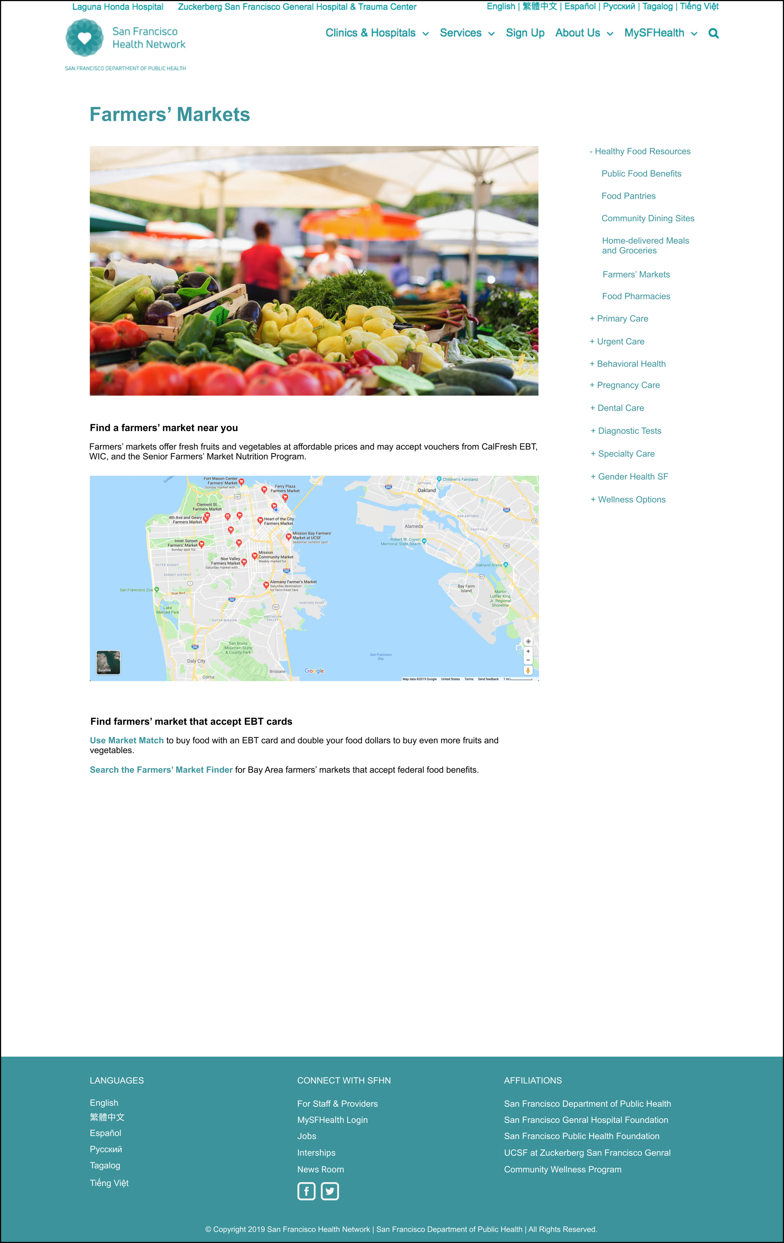
At the end of the 3-week sprint, we created two web-based, scalable, and mobile-responsive solutions for users to be able to access reliable information quickly and easily:
Constraints
Both solutions required adherence to established design systems and standards the city already has in place.
My Role
User Research, Content Strategy, Usability Testing, Data Analysis, High Fidelity Mockups
Team
Megan Bates, Josh Lau
Process
Discover
How Might We Improve the Way San Franciscans Find Affordable, Healthy Food?
Given the time constraints of this sprint, I leveraged the SFDPH’s prior research on food insecurity in SF to better understand the context and target users to design for. I learned that despite the multitude of diverse food access programs available, the lack of a digital “one stop shop” creates a gap between food access programs and residents that are eligible for them:
I also discovered food insecure residents are an especially vulnerable population with specific needs to address in the design strategy:
User Interviews: Identifying Wayfinding Patterns
I conducted interviews with 13 proxy users to discover where and how users would search for food resources. Because both SFHN and SF.gov are robust websites, understanding navigation patterns and expected naming conventions to maximize findability was especially important given the considerations of the target users.
Insights I generated from user interviews built a strong recommendation for creating a new Healthy Food Resources subcategory under Services:
7 out of 13 users expected to find food access resources under Services
The most common search terms were “food” and “healthy” (likely due to this being a Public Health department site)
I created a quick mockup with the proposed Healthy Food Resources page to visualize where it would reside within the SFHN ecosystem:
Comparative Research: Understanding the Landscape
Comparative analysis helped gain a better understanding of how information is structured in digital resources created by organizations and healthcare systems addressing food insecurity in other cities. This enabled informed decision-making of features to include in the MVP.
Define
Organizing Programs and Services into a Single Source of Information
The team decided to leverage already existing resources and approach the problem with a landing page and food programs organized into subcategory index pages.
The team prioritized features critical for users to achieve their goals and enhance accessibility.
The team surveyed the current food access program landscape in SF and compiled resources into 5 subcategories to build the information architecture.
I structured content for the 6th subcategory, Food Pharmacies, in collaboration with the SFHN program manager overseeing the Food Pharmacies program. This innovative program run by SFHN did not have an online presence, and Healthy Food Resources is an opportunity to raise awareness of the program and the connection between food and health.
Develop
Translating Ideas into Wireframes
A low-fidelity, clickable prototype was created from the wireframes to gather usability testing insights.
Usability Testing Revealed Some Information was Difficult to Find
The team conducted testing at the Heart of the City farmers’ market, which aims to make fresh food accessible to low-income residents by operating the largest farmers' market Electronic Benefit Transfer (EBT) program in California.
We created 6 scenarios/tasks and asked 10 users to test our design solution’s effectiveness in helping users successfully find information they need. I measured time on task and pass/fail analysis for each user and task.
Deliver
Implementing Design Iterations to Reduce Time on Task
My biggest takeaway from usability testing was to decrease the time to find information. This is essential for a user urgently needing food with constraints such as limited internet access.
Iteration 1: Utilized recognizable keywords and calls to action to frame information from user’s perspective
“What’s in it for me?”
— User
Iteration 2: Streamlined text to find important information faster
“[The text] is overwhelming”
— User
Iteration 3: Replaced photos with vector images for faster loading time
Iteration 4: Incorporated maps to locate programs and services near user
Envisioning the “North Star” Design Solution
The team created high-fidelity mockups according to the SF.gov specifications to enable SFDPH to be ready when the redesign rolls out to the Healthy Food Resources pages.
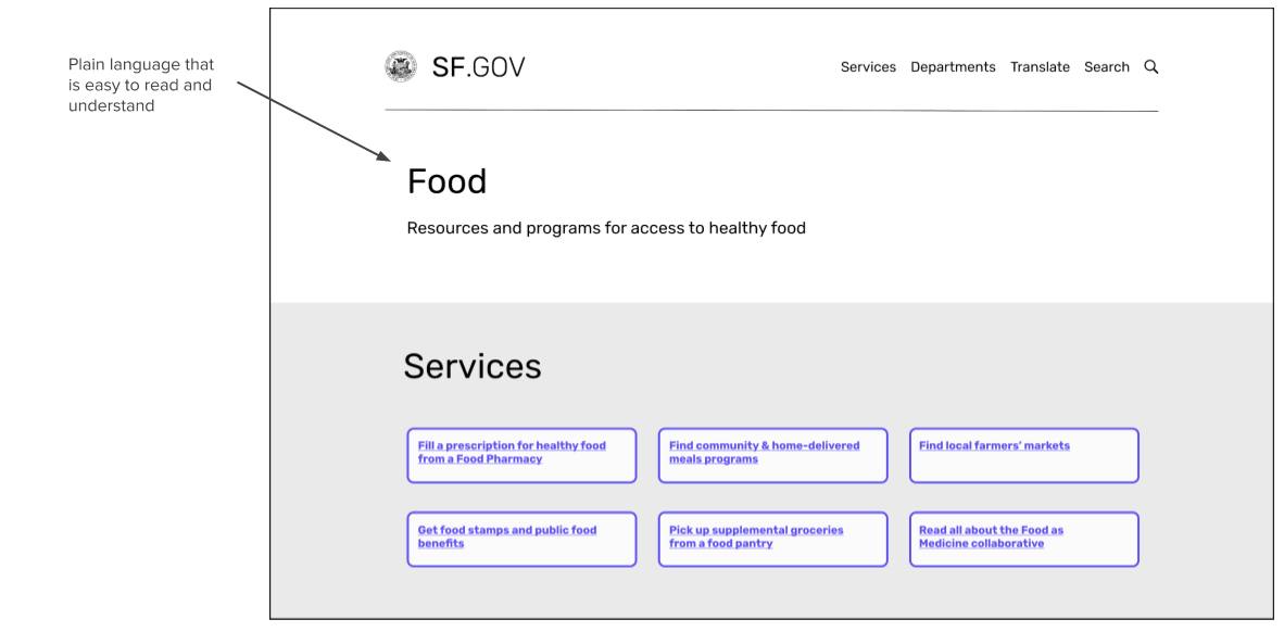
Iteration 1: Plain language to maximize readability
Iteration 2: High contrast visual indicators for interactive elements
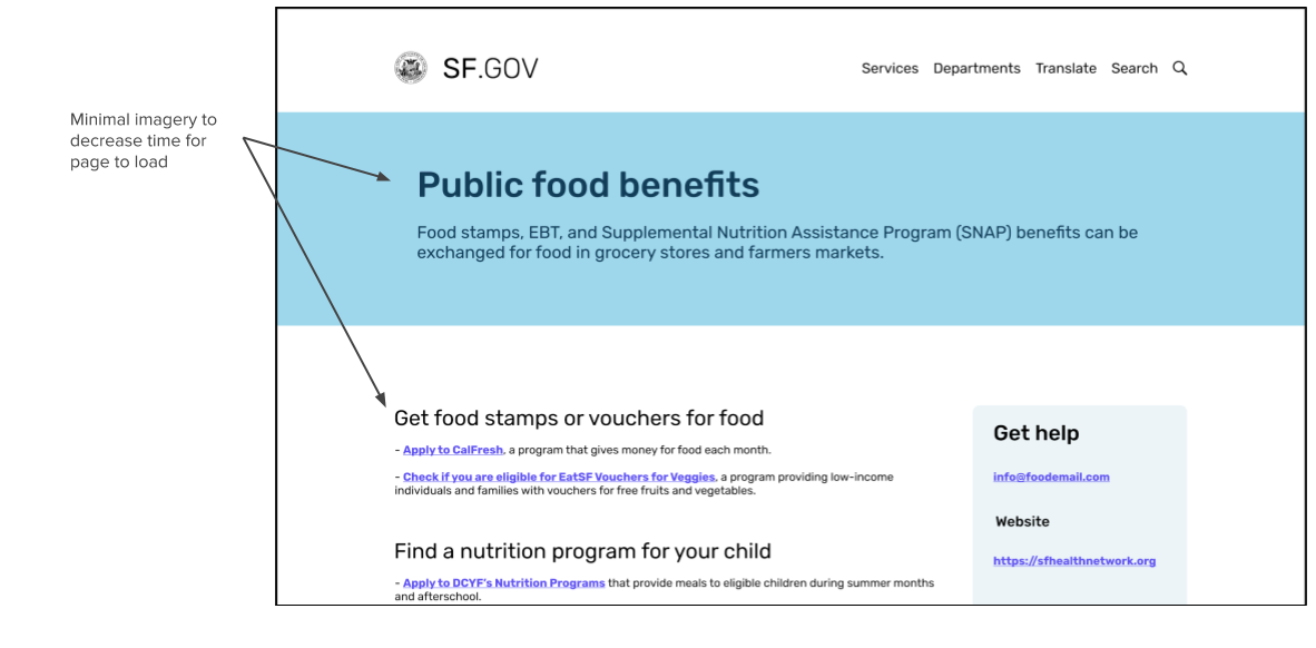
Iteration 3: Minimal imagery for fastest load time regardless of device
Final Mockups: MVP


Final Mockups: “North Star”

Conclusion
Food insecurity is often interrelated with health problems, housing insecurity, and social isolation that low-income families often experience. My goal as a designer was to not only connect residents to food resources, but build a connection between food and health. At the end of this 3-week sprint, we were able to tackle an unmet need in the community by bringing clarity to a disconnected space.
If I had more time for this project, I would have liked to conduct interviews with food insecure residents to directly understand their pain points and conduct further usability tests on the iterations to see if the pass/fail rate and time on task improved.


